Guides for SE student projects »
JavaFX tutorial part 5 – Tweaking the GUI
This part of the tutorial aims to help you with some of the layout/CSS related aspects so that you may focus more on designing your own GUI. As this guide is kind of long, it can feel daunting to get started, especially for the CSS sections. Therefore, feel free to only look at the sections that interest you. This section containing the CSS dummy code and linking it to Scene Builder might be the most helpful.
Setting the dimensions
As you may have noticed, some of the elements do not automatically follow the dimension of the app when resizing:
TextFielddoes not automatically resize horizontallySendbutton does not follow to the bottom right of the appScrollPanedoes not automatically resize either horizontally and vertically
To rectify this, we can use a combination of the following two techniques:
Automatically Resize Elements
We want to anchor the following nodes:
- Anchor
TextFieldto the bottom while also automatically resizing horizontally - Anchor
Send Buttonto the bottom right of the app - Anchor
ScrollPaneto resize both horizontally and vertically
We can do this in FXML. Alternatively, we can do this in Scene Builder, as shown in later sections.
<?xml version="1.0" encoding="UTF-8"?>
<?import javafx.scene.control.Button?>
<?import javafx.scene.control.ScrollPane?>
<?import javafx.scene.control.TextField?>
<?import javafx.scene.layout.AnchorPane?>
<?import javafx.scene.layout.VBox?>
<AnchorPane maxHeight="-Infinity" maxWidth="-Infinity" minHeight="-Infinity" minWidth="-Infinity" prefHeight="600.0" prefWidth="400.0" xmlns="http://javafx.com/javafx/20.0.1" xmlns:fx="http://javafx.com/fxml/1" fx:controller="MainWindow">
<children>
<TextField fx:id="userInput" layoutY="558.0" onAction="#handleUserInput" prefHeight="41.0" prefWidth="324.0" AnchorPane.bottomAnchor="1.0" AnchorPane.leftAnchor="0.0" AnchorPane.rightAnchor="76.0" />
<Button fx:id="sendButton" layoutX="324.0" layoutY="558.0" mnemonicParsing="false" onAction="#handleUserInput" prefHeight="41.0" prefWidth="76.0" text="Send" AnchorPane.bottomAnchor="1.0" AnchorPane.rightAnchor="0.0" />
<ScrollPane fx:id="scrollPane" fitToWidth="true" hbarPolicy="NEVER" hvalue="1.0" prefHeight="557.0" prefWidth="400.0" vvalue="1.0" AnchorPane.bottomAnchor="43.0" AnchorPane.leftAnchor="0.0" AnchorPane.rightAnchor="0.0" AnchorPane.topAnchor="0.0">
<content>
<VBox fx:id="dialogContainer" prefHeight="552.0" prefWidth="388.0" />
</content>
</ScrollPane>
</children>
</AnchorPane>
Anchor TextField
Open src/main/resources/view/MainWindow.fxml in Scene Builder and click on TextField. On the right accordion pane you should be able to see the AnchorPane constraints of the TextField.
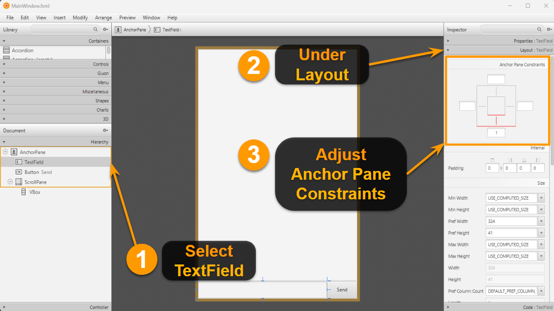
Children within AnchorPane are able to "anchor" their edges to the AnchorPane itself if a constraint is set.
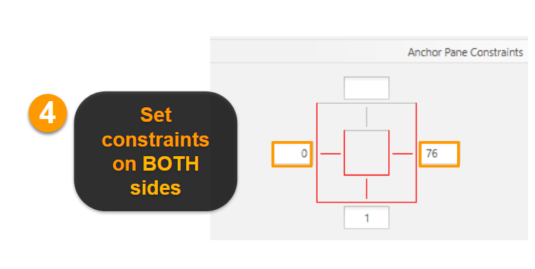
Since we want to automatically resize the TextField horizontally (but not vertically) whenever we resize the window, we need to put an anchor constraint on the left and right edges. Click on the left and right boxes as shown below, and it will automatically set a value based on its current position relative to the AnchorPane. Note that the right side is set to 76 as this is the width of the button next to it.
Save MainWindow.fxml and run to test your app out to see if it works when you resize the window.
Anchored TextField:
Alternatively, we can adjust in this line in the FXML code as highlighted (scroll to the right):
<TextField fx:id="userInput" layoutY="558.0" onAction="#handleUserInput" prefHeight="41.0" prefWidth="324.0" AnchorPane.bottomAnchor="1.0" AnchorPane.leftAnchor="0.0" AnchorPane.rightAnchor="76.0" />
Anchor Send Button
Since we want to anchor the button to the bottom right corner of the window, we set the anchor values for the bottom and right side.
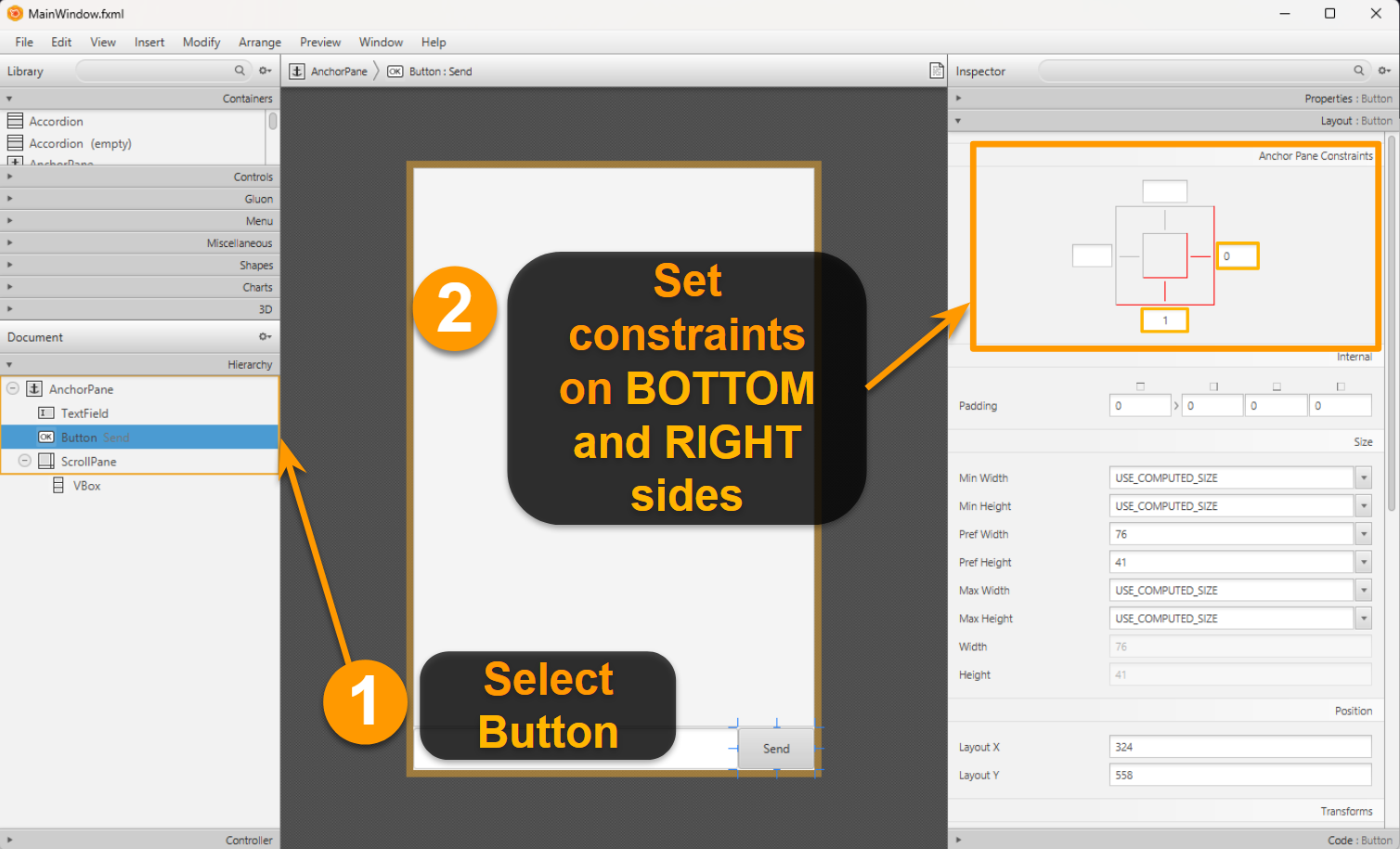
Save MainWindow.fxml and run to test your app out to see if it works when you resize the window.
Anchored TextField and Send Button:
Alternatively, we can adjust in this line in the FXML code as highlighted (scroll to the right):
<Button fx:id="sendButton" layoutX="324.0" layoutY="558.0" mnemonicParsing="false" onAction="#handleUserInput" prefHeight="41.0" prefWidth="76.0" text="Send" AnchorPane.bottomAnchor="1.0" AnchorPane.rightAnchor="0.0" />
Anchor ScrollPane
Since we want to resize the chat both horizontally and vertically, we set the anchor pane constraints to all edges.
At the same time we enable Fit To Width so that the contents within the ScrollPane resize as well.
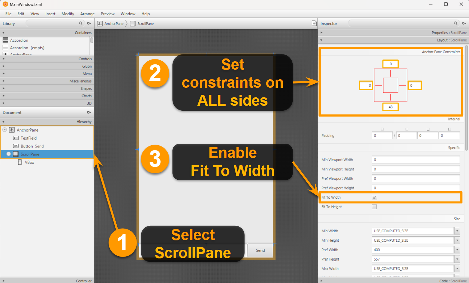
Save MainWindow.fxml and run to test your app out to see if it works when you resize the window.
Anchored TextField, Send Button and ScrollPane:
Alternatively, we can adjust in this line in the FXML code as highlighted (scroll to the right):
<ScrollPane fx:id="scrollPane" fitToWidth="true" hbarPolicy="NEVER" hvalue="1.0" prefHeight="557.0" prefWidth="400.0" vvalue="1.0" AnchorPane.bottomAnchor="43.0" AnchorPane.leftAnchor="0.0" AnchorPane.rightAnchor="0.0" AnchorPane.topAnchor="0.0">
Setting limit to Window size
If you don't want the user to be able to resize the window below certain limits, you can set the minimum height and width.
If you don't want to let the user resize horizontally, you can set the maximum width = minimum width.
Update the start method as shown below.
public void start(Stage stage) {
try {
// current code...
stage.setMinHeight(220);
stage.setMinWidth(417);
// stage.setMaxWidth(417); // Add this if you didn't automatically resize elements
fxmlLoader.<MainWindow>getController().setDuke(duke);
stage.show();
} catch (IOException e) {
e.printStackTrace();
}
}
Customize with JavaFX CSS!
Suppose you want to customize colors, shapes, borders, and other design elements. The most effective way to do this is through CSS, so this will be a mini JavaFX CSS introductory guide.
If you are new to CSS entirely, a quick way to learn the basics is either through this YouTube tutorial or through this quick guide. Alternatively, you can look through all the syntax through this JavaFX CSS reference guide
Setting up and linking CSS to FXML
Create the following files in src/main/resources/css:
.root {
main-color: rgb(237, 255, 242); /* Create a looked-up color called "main-color" within root. */
-fx-background-color: main-color;
}
.text-field {
-fx-background-color: #d9ffe2;
-fx-font: 20px "Arial";
}
.button {
-fx-background-color: mediumspringgreen;
-fx-font: italic bold 16px "Arial";
}
.button:hover {
-fx-background-color:cyan;
-fx-font-size: 18px;
}
.button:pressed {
-fx-background-color:orange;
-fx-font-size: 20px;
}
.scroll-pane,
.scroll-pane .viewport {
-fx-background-color: transparent;
}
.scroll-bar {
-fx-font-size: 10px; /* Change width of scroll bar. */
-fx-background-color: main-color;
}
.scroll-bar .thumb {
-fx-background-color: #ff9cb4;
-fx-background-radius: 1em;
}
/* Hides the increment and decrement buttons. */
.scroll-bar .increment-button,
.scroll-bar .decrement-button {
-fx-pref-height: 0;
-fx-opacity: 0;
}
.label {
-fx-background-color: linear-gradient(to bottom right, #00ffbf, #00ddff);
-fx-border-color: #d55e00 #009e73 #cc79a7 #0072b2;
-fx-border-width: 2px;
-fx-background-radius: 1em 1em 0 1em;
-fx-border-radius: 1em 1em 0 1em;
}
.reply-label {
-fx-background-radius: 1em 1em 1em 0;
-fx-border-radius: 1em 1em 1em 0;
}
#displayPicture {
/* Shadow effect on image. */
-fx-effect: dropshadow(gaussian, rgba(0, 0, 0, 0.2), 10, 0.5, 5, 5);
/* Change size of image. */
-fx-scale-x: 1;
-fx-scale-y: 1;
/* Rotate image clockwise by degrees. */
-fx-rotate: 0;
}
Proceed with the following steps to link the CSS files to the FXML files through Scene Builder.
Open
MainWindow.fxmlin Scene Builder, select theAnchorPane.On the right accordion pane, click on the plus sign under Stylesheets within Properties as shown below and choose the previously created
src/main/resources/css/main.cssfile.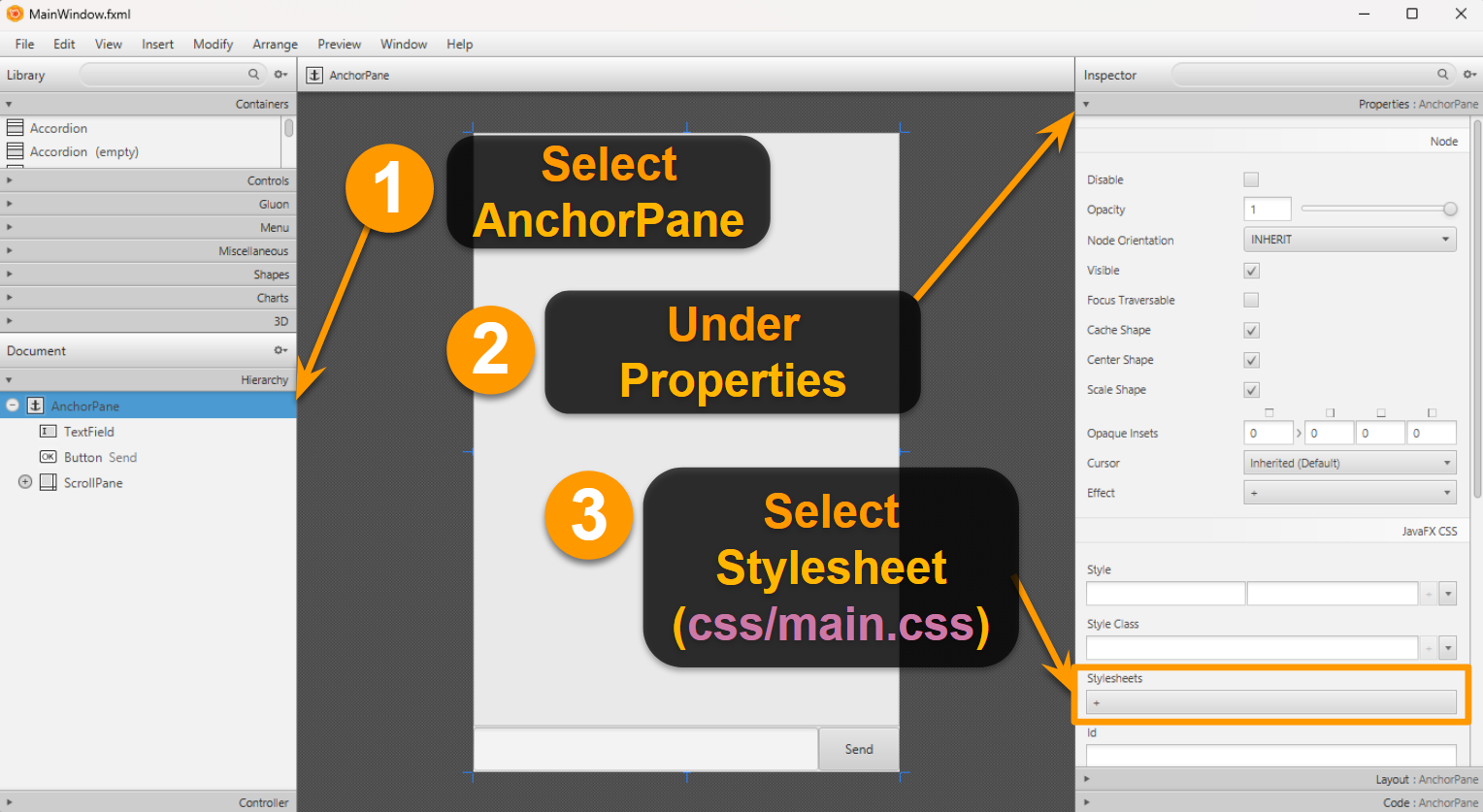
If you don't see this updated view, try saving, then reopening the file with Scene Builder again.
Remember to save the
.fxmlfile after linking!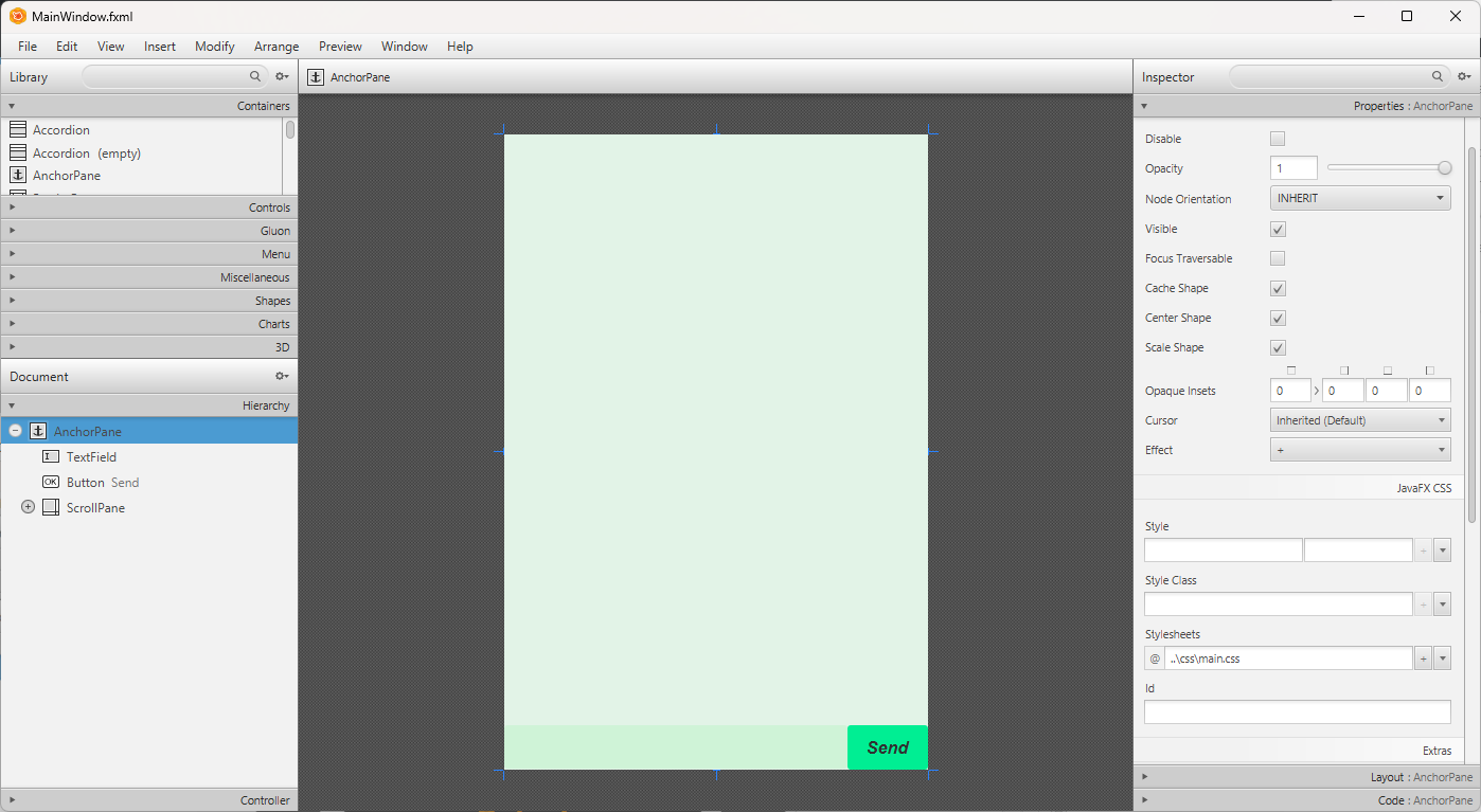
Repeat steps 1-3 for
DialogBox.fxmlwithdialog-box.css.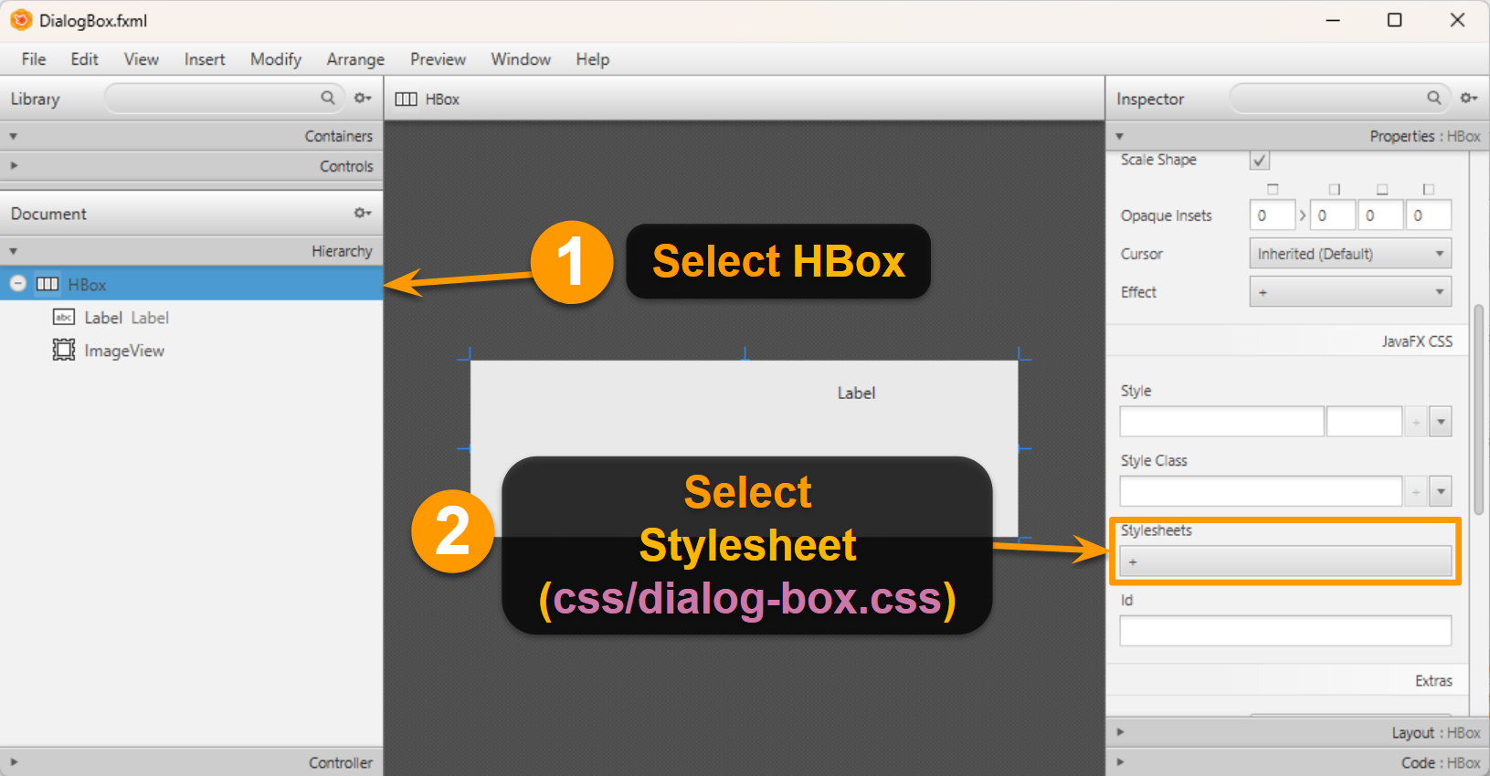
Save the FXML files and run the app to test it!
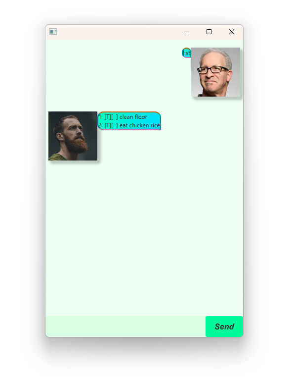
Flipped text bubbles
You may have noticed that the text bubbles are not facing the right direction for DaDuke.
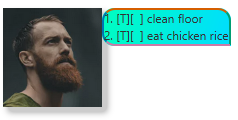
We created a style class specifically for this case:
.reply-label {
-fx-background-radius: 1em 1em 1em 0;
-fx-border-radius: 1em 1em 1em 0;
}
We can add the .reply-label style to the dialog box when we flip the message for DaDuke.
Update the following code:
private void flip() {
// current code...
dialog.getStyleClass().add("reply-label");
}
Padding and Margin
In short, padding represents the space between the content and its border, while margin represents the invisible space around the border.
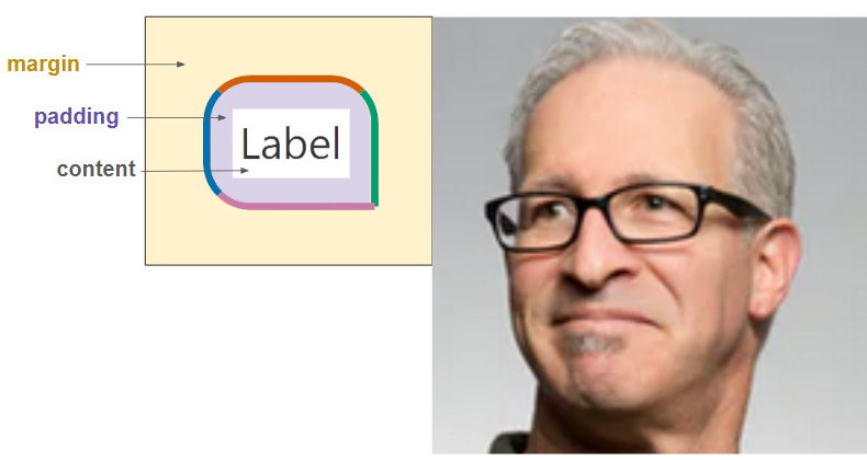
Let us play around with the padding and margin of the text bubble.
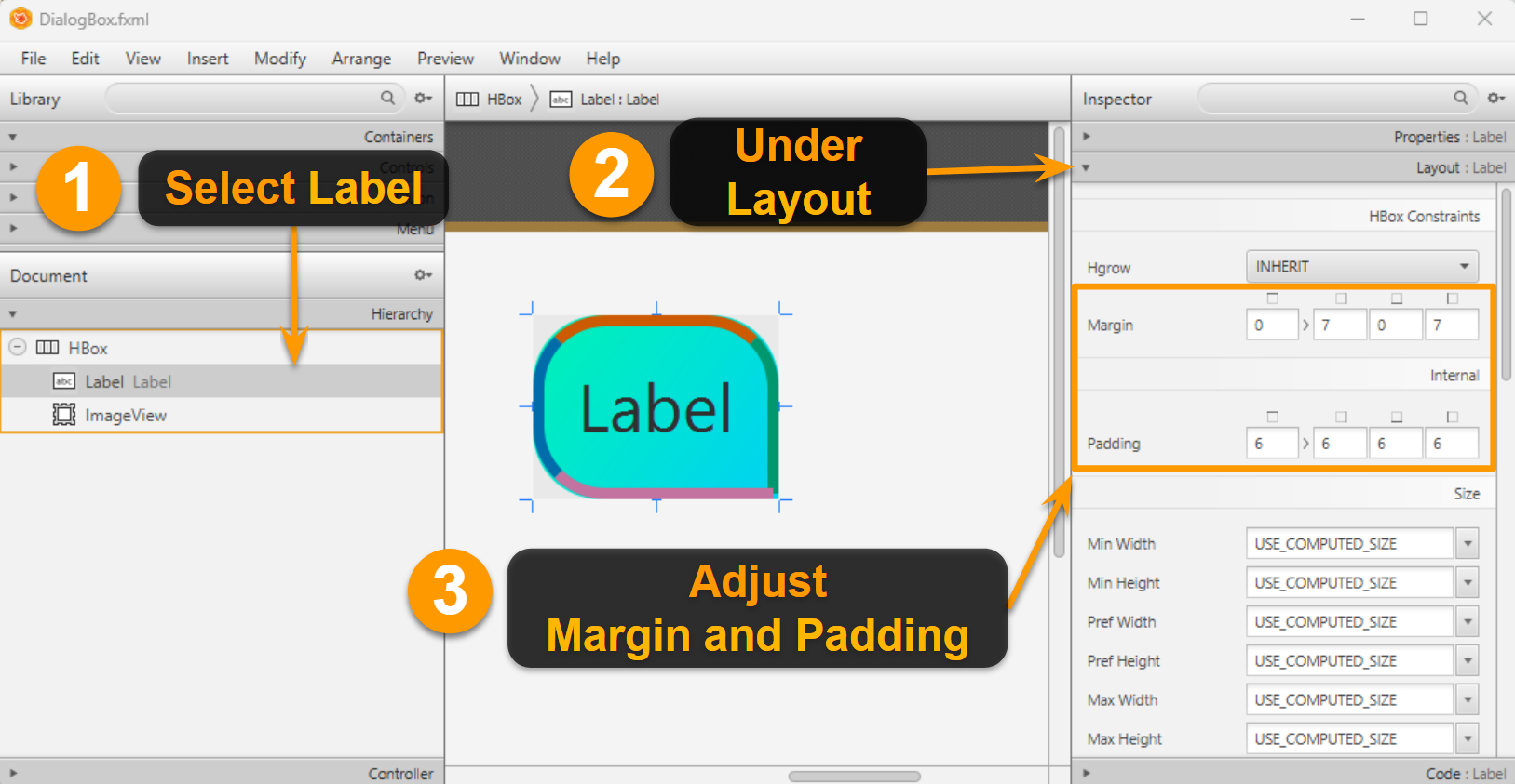
Open DialogBox.fxml in Scene Builder. Click on Label, and look at layout in the right accordion panel.
Default controls for zooming and zooming out in Scene Builder
Zoom in: [CTRL] + [+] or [ALT] + [⌘] + [=]
Zoom out: [CTRL] + [/] or [ALT] + [⌘] + [-]
Margin and padding used in this example:
Margin: 0, 7, 0, 7Padding: 6, 6, 6, 6
Alternatively, we can update in the FXML code:
<Label fx:id="dialog" text="Label" wrapText="true">
<HBox.margin>
<Insets left="7.0" right="7.0" />
</HBox.margin>
<padding>
<Insets bottom="6.0" left="6.0" right="6.0" top="6.0" />
</padding>
</Label>
Alternatively, we can update in the CSS code:
.label {
-fx-background-color: linear-gradient(to bottom right, #00ffbf, #00ddff);
-fx-border-color: #d55e00 #009e73 #cc79a7 #0072b2;
-fx-border-width: 2px;
-fx-background-radius: 1em 1em 0 1em;
-fx-border-radius: 1em 1em 0 1em;
-fx-padding: 6px;
-fx-border-insets: 0px 7px 0px 7px;
-fx-background-insets: 0px 7px 0px 7px;
}
Unfortunately, there is no JavaFX CSS property for margin. We can combine fx-border-insets with fx-background-insets to simulate margin.
Play around with the padding and margin and find the parameters that is most suitable for you!
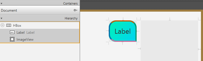
To view the effects of the margin, you may either
- Run the app
- Select both
ImageViewandLabelto view the distance between them
Borders
Labels, TextBoxes, Buttons, more or less all the nodes used so far are subclasses of Region, and hence share the following CSS properties for borders:
| CSS property | Description |
|---|---|
-fx-border-color | Set border color. |
-fx-border-radius | Set the "roundedness" of the border. |
-fx-border-width | Set border thickness. |
-fx-border-style | Set style of border (e.g., can be dashed or bolded). |
-fx-border-insets | Set space between the border and the outer edge of the region. |
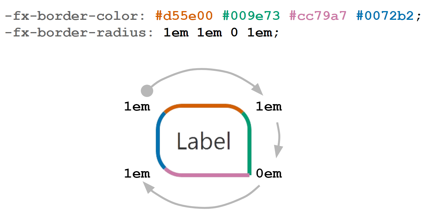
For all of these properties, you can either set a single value to apply to all corners/sides, or you can set them individually on each corner/side. To demonstrate this, let us take a look at the following code for our text bubble:
.label {
-fx-background-color: linear-gradient(to bottom right, #00ffbf, #00ddff);
-fx-border-color: #d55e00 #009e73 #cc79a7 #0072b2;
-fx-border-width: 2px;
-fx-background-radius: 1em 1em 0 1em;
-fx-border-radius: 1em 1em 0 1em;
}
For fx-border-width, a single value is used, so the value 2px is applied to all sides.
For fx-border-color, fx-background-radius, fx-border-radius, there are 4 values used. The values are set in a clockwise manner starting from the top left corner/top edge.
Color
There are a few ways to set a color.
- Using
rgb/rgba - Using HEX
#ffffff - Using an existing named color
- Using your own defined (looked-up) color
- Using gradients
- Using a ladder to change color based on the background
- Using derive to get a brighter or darker version of a selected color
These are the common JavaFX properties to set colors:
-fx-border-color-fx-text-fill(set text color)-fx-background-color
RGB or RGBA
RGB represents Red Green Blue, and each color takes in a value between 0 and 255.
-fx-text-fill: rgb(247, 124, 146) /* Light pinkish red color */
RGBA on the other hand represents Red Green Blue Alpha, where alpha represents the opacity. And it takes in a value between 0 and 1.
In this example, the opacity is set to 50% (0.5). You can test it out with .label in dialog-box.css!
-fx-background-color: rgba(0, 0, 0, 0.5) /* Black with opacity of 0.5 */
HEX
Note that since each color (red, green, blue) values are from 0 to 255. This can be represented from 0 to FF! You can learn more about hexadecimals here. The format for hex is #rrggbb.
-fx-background-color:#f77c92 /* Light pinkish red color */
You can also set with a shorter format.
-fx-background-color:#fb2 /* Equivalent to #ffbb22 */
-fx-background-color:#fff /* Equivalent to #ffffff */
Looked-up Color
You can define a color within the .root selector, which can be referenced by other classes within the stylesheet.
.root {
main-color: rgb(237, 255, 242); /* Create a looked-up color called "main-color" within root */
-fx-background-color: main-color;
}
.scroll-bar {
...
-fx-background-color: main-color; /* Using looked-up color */
}
Gradient color
To set a gradient color, we can either use linear or radial gradient.
Linear Gradient | 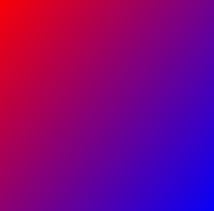 | |
Radial Gradient | 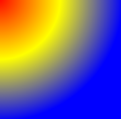 | |
Ladder
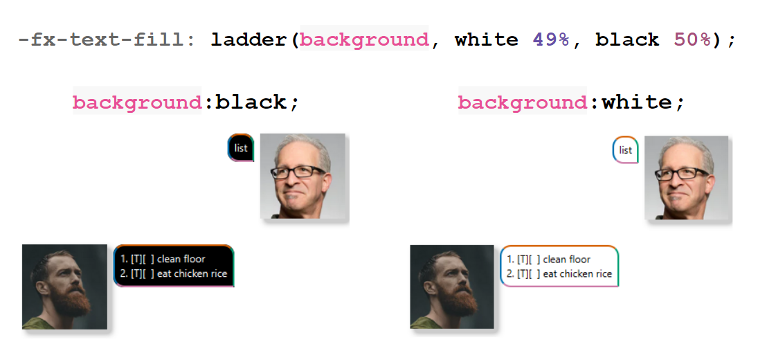
We can also automatically change color based on the brightness level of a specific color. To demonstrate this, let us temporarily update the code:
.label {
background:white;
-fx-background-color: background;
-fx-border-color: #d55e00 #009e73 #cc79a7 #0072b2;
-fx-border-width: 2px;
-fx-background-radius: 1em 1em 0 1em;
-fx-border-radius: 1em 1em 0 1em;
-fx-text-fill: ladder(background, white 49%, black 50%);
}
This line means that the font color will turn white if the brightness of background color is between 0%-49%, and it will turn black if the brightness level is between 50%-100%.
Derive
We can set a brighter or darker color based on a specific color.
| |||
| | ||
| | ||
| | ||
| |
States
You can set different properties for different states of a node.
For example, let us take a look at the send button:
.button {
-fx-background-color:springgreen;
-fx-font: italic bold 16px "Arial";
}
.button:hover {
-fx-background-color:cyan;
-fx-font-size: 18px;
}
.button:pressed {
-fx-background-color:orange;
-fx-font-size: 20px;
}
In this case, there are three different states:
- Default, when nothing happens to the button
:hover, when your mouse hovers the button:pressed, when you click on the button
This works for TextFields/Labels/Images as well.
Other state(s) include:
:focused, when the node is selected (e.g., selecting theTextField)
Image and shadows
Since an ImageView is a node, we can play around with the size, opacity, rotation, and more. This also means that the following properties can also be used for other kind of nodes.
#displayPicture {
/* Shadow effect on image. */
-fx-effect: dropshadow(gaussian, rgba(0, 0, 0, 0.2), 10, 0.5, 5, 5);
/* Change size of image. */
-fx-scale-x: 1;
-fx-scale-y: 1;
/* Rotate image clockwise by degrees. */
-fx-rotate: 0;
}
Note that the # symbol is used to select the node by its ID (or variable),
meaning it applies the style to just displayPicture and not to ImageViews in general.
This is different from using a class selector (which uses .).
There are 2 different types of shadow effects: Drop shadow and Inner shadow. Additionally, if you use an image with a transparent background (e.g., this doggy), the shadow effect will not apply to the transparent areas.
Drop Shadow |   | |
Inner Shadow |  | |
Java CSS Reference Guide
The JavaFX CSS reference guide is a very helpful way to find out what properties are used for different nodes. You can also see the name of the style classes, like .label and
.text-field. Additionally, most elements/nodes (including panes) are Regions, so they inherit those properties as well.
Some nodes don't have a style class name, like ImageView. To customize such nodes, you can either:
- Create your own style class manually
- Apply style to just that specific node with the id (e.g.,
#displayPicture) instead
Enhancements
Change style dynamically based on command
Let's create different style classes for the following commands:
- Add a task (includes
todo,deadline, andevent) marka taskdeletea task
Create style classes for each type of command in
dialog-box.css.css/dialog-box.css/* Paste this below reply-label */ .add-label { -fx-background-color: yellow; } .marked-label { -fx-background-color: palegreen; } .delete-label { -fx-background-color: lightpink; }Update the code in
Duke.javaso that we can grab and store the command type.Note that it may look different for your code, so use this as reference instead of copying.
Duke.java// ... private String commandType; // ... public String getResponse(String input) { try { Command c = Parser.parse(input); c.execute(tasks, ui, storage); commandType = c.getClass().getSimpleName(); return c.getString(); } catch (DukeException e) { return "Error: " + e.getMessage(); } } public String getCommandType() { return commandType; }Update the code in
MainWindow.javato pass the command type fromDuketoDialogContainer.MainWindow.java@FXML private void handleUserInput() { String input = userInput.getText(); String response = duke.getResponse(input); String commandType = duke.getCommandType(); dialogContainer.getChildren().addAll( DialogBox.getUserDialog(input, userImage), DialogBox.getDukeDialog(response, dukeImage, commandType) ); userInput.clear(); }Update the code in
DialogBox.javato change the style ofdialogusingchangeDialogStyle.Note that it may look different for your code, so use this as reference instead of copying.
DialogBox.javaprivate void changeDialogStyle(String commandType) { switch(commandType) { case "AddCommand": dialog.getStyleClass().add("add-label"); break; case "ChangeMarkCommand": dialog.getStyleClass().add("marked-label"); break; case "DeleteCommand": dialog.getStyleClass().add("delete-label"); break; default: // Do nothing } } // ... public static DialogBox getDukeDialog(String text, Image img, String commandType) { var db = new DialogBox(text, img); db.flip(); db.changeDialogStyle(commandType); return db; }Run and test it!
Set image as background
We can set a background image using CSS. Let's set the background image (in src/main/resources/images/) for our AnchorPane as follows:
Resize Image
Resizing but keeping the aspect ratio of the image.
.root {
main-color: rgb(237, 255, 242);
-fx-background-color: main-color;
-fx-background-image: url("../images/background.jpg"); /* Set image */
-fx-background-size: cover;
}
Stretch Image
Stretching the background image according to window size.
.root {
main-color: rgb(237, 255, 242);
-fx-background-color: main-color;
-fx-background-image: url("../images/background.jpg"); /* Set image */
-fx-background-size: stretch;
}
Repeat Image
We have a few options for how we want to repeat our background image.
Pictures only repeat when there is enough space in the background, otherwise it will stretch the pictures.
.root {
main-color: rgb(237, 255, 242);
-fx-background-color: main-color;
-fx-background-image: url("../images/background.jpg");
-fx-background-size: 400px 600px;
-fx-background-repeat: round;
}
If the window is smaller than the -fx-background-size, the background picture will disappear.
.root {
main-color: rgb(237, 255, 242);
-fx-background-color: main-color;
-fx-background-image: url("../images/background.jpg");
-fx-background-size: 400px 600px;
-fx-background-repeat: space;
}
.root {
main-color: rgb(237, 255, 242);
-fx-background-color: main-color;
-fx-background-image: url("../images/background.jpg");
-fx-background-size: 400px 600px;
-fx-background-repeat: repeat;
}
.root {
main-color: rgb(237, 255, 242);
-fx-background-color: main-color;
-fx-background-image: url("../images/background.jpg");
-fx-background-size: 400px 100%;
-fx-background-repeat: repeat stretch;
}
Remember to put 100% when stretching in that particular axis!
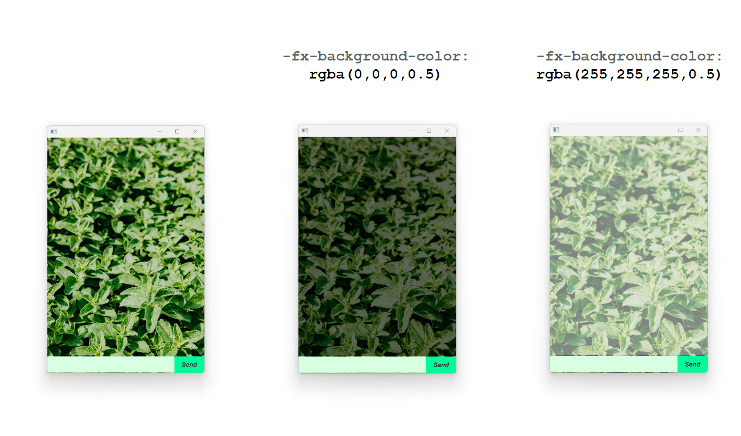
Changing "Opacity"
We can't directly adjust the opacity of the background image in .root. However, we can set a colored, translucent background in .scroll-pane (note that .scroll-pane is above AnchorPane) to simulate the image opacity. Separate the 2 style classes in main.css as follows:
.scroll-pane {
-fx-background-color: rgba(0,0,0,.5);
}
.scroll-pane .viewport {
-fx-background-color: transparent;
}
Other things to consider
Here are other things you can do with your app to make it more personalized:
- Add a placeholder for
TextFielde.g., ("Type here...") - Change style for error messages
- Change the title and icon of your app
- Use an image for the button
- Make profile pictures circular
- Set GIFs as profile pictures
- Add sound effects when sending messages
Authors:
- Initial Version: Debbie Hii (@flexibo)