A Student's Guide to Software Engineering Tools & Techniques »
Design Systems
Author(s): Tan Heng Yeow
Reviewers: Ronak Lakhotia, Metta Ong
What is a Design System?
The following definition best encapsulates the essence of a Design System.
A Design System is the Single Source of Truth which groups all the elements that will allow the teams to design, realize and develop a product. --Blog post from UX Collective
The typical structure of a Design System looks like this:
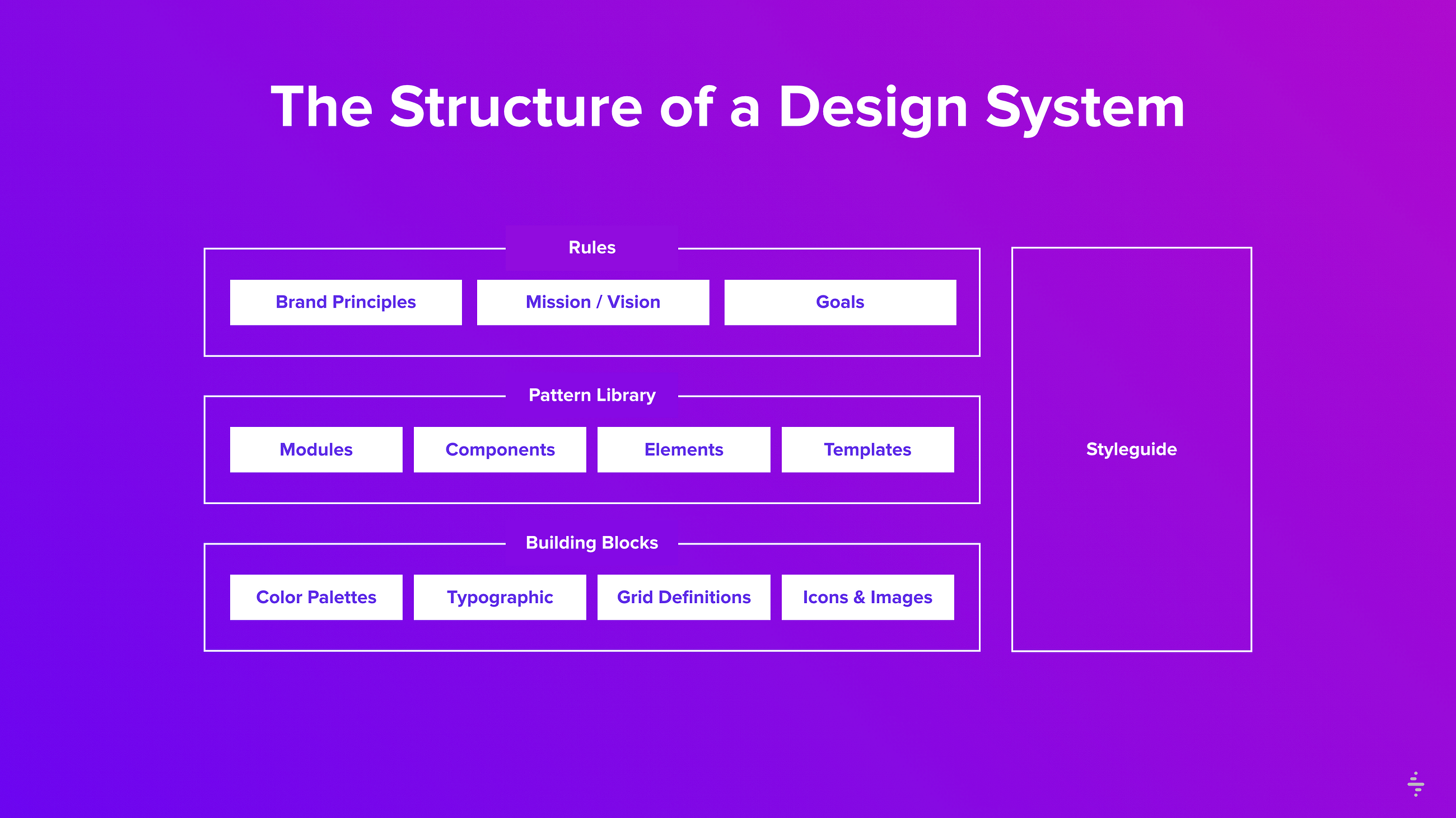
Figure 1. Typical structure of a Design System (source)
Below is a brief explanation of the parts that make up a Design System. The explanation includes reference to a living example, Polaris, Shopify's Design System.
- Rules: Rules include abstract elements such as brand values, mindset, and shared beliefs. For example, one of Polaris' product experience principles is to Put merchants first. The principle promotes thinking about the needs of different types of merchants and be intentional about how to respond to them in the product or feature.
- Pattern Library: A Pattern Library integrates functional components and their usage. For example, Shopify's product component library contains a custom Datepicker component for merchants to select a date range.
- Building Blocks: Building Blocks refer to documentation consisting of the collection of interface elements. Polaris has a section which describes their components in detail. For example, the custom Datepicker component is clearly documented with different examples.
- Style Guide: A Style Guide focuses on graphic styles such as colors, fonts, illustrations, etc and their usage. For example, Polaris' style guide recommends to use Indigo for buttons and avoid using Indigo for text links.
Why Should We Use a Design System?
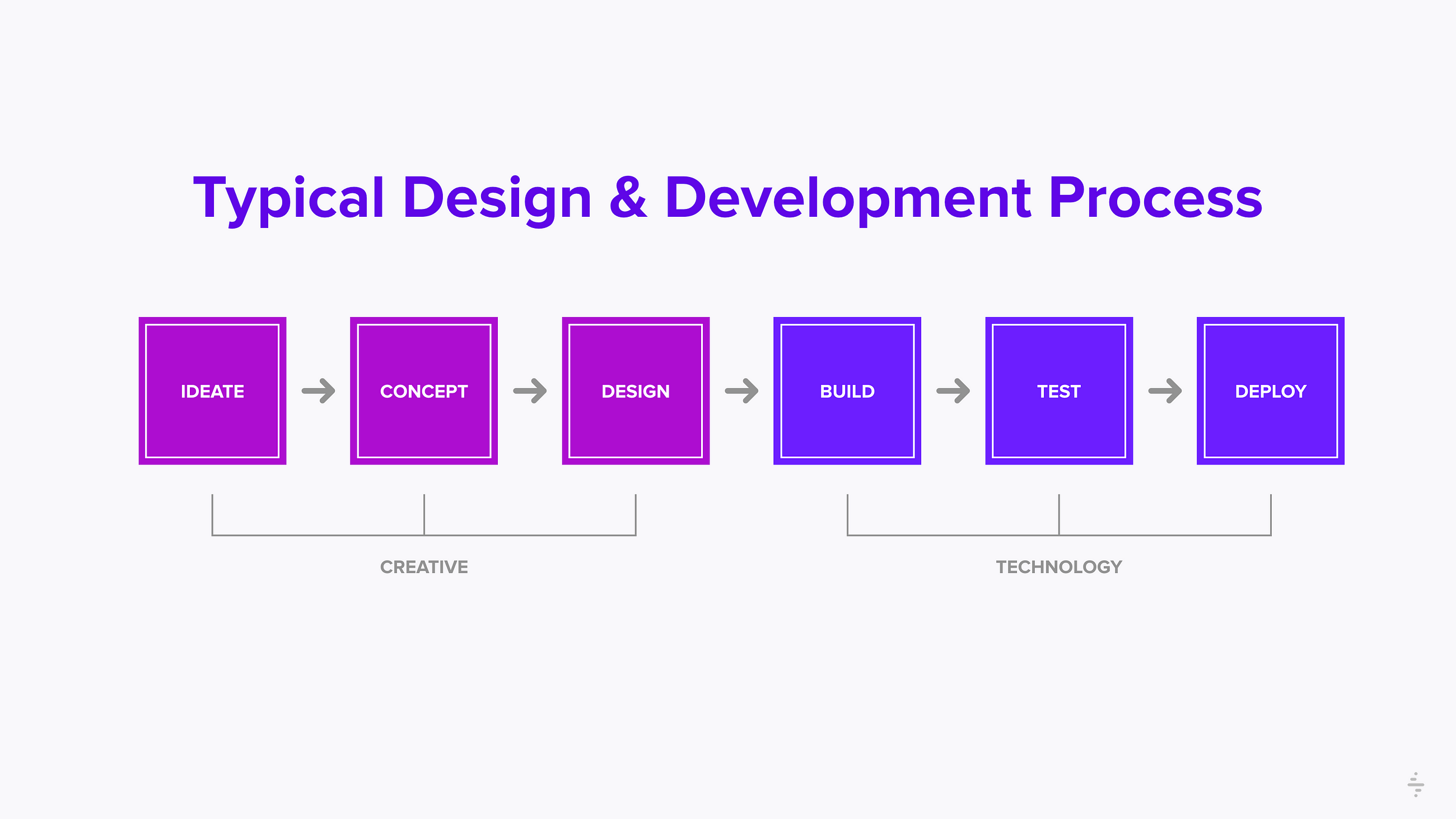
Figure 2. Typical Design and Development process (source)
Consider the typical design and development process. Designers come up with sketches, wireframes and hand them over to the developers to implement them through code. Here's the problem:
Designers are looking at multiple directions and solutions, constantly comparing and tweaking their design. On the other hand, developers are ultimately accountable for shipping code. They focus on making sure that the correct architecture is in place, thinking about security and the performance of the product, hoping that the designers already have all the design details thought out.
Over time, it is likely that many teams working on different parts of the product will create UI/UX design inconsistencies in the product. For example, HubSpot explained how they found UI/UX design inconsistencies in their interface after auditing their User Interface (UI) components.
Here is another example of a conversation held at Modus Create, a digital product agency, highlighting a similar problem.

Figure 3. Conversation at Modus Create (source)
Why Not Front-End Frameworks or Style Guides?
Front-end frameworks such as Bootstrap have reusable components that save a lot of time and effort. However, there are a few disadvantages:
- Not suitable for designers: Sketch is an industry standard tool used by designers for UI design. Most front-end frameworks do not have relevant .sketch or source files that allow them to change the design of components in the framework.
- Not suitable for extensive customization: Products with a distinctive level of identity require additional development effort, which defeats the point of using a framework.
- Not suitable for apps that emphasize on performance: Front-end frameworks come with elements that the team may not need. The unused code could reduce overall performance.
Style guides present components that can be used quickly in mockups. This is an example of Tor's style guide. However, there are a few disadvantages:
- Not easily traceable: It is hard to trace where the components came from as different types of components may be built over time by different teams.
- Not easily documented: Most of the time, style guides lack documentation on what each component does. Also, too much documentation may decrease reusability of components because it is infeasible for designers/developers to go through a lot of pages to find a component they wish to use.
Benefits of a Design System
Design Systems combine the good parts of front-end frameworks and style guides.
Benefit 1: Shared Common Language
Design Systems act as a Single Source of Truth. This allows the whole organization to access changes and updates. Any member of a team would have complete documentation of design mock-ups at their fingertips. This results in fewer misunderstandings and much better implementation of designs.
Design Systems also elimate knowledge silos. There is a lesser risk of context gaps being formed because information is shared across teams.
Benefit 2: Reusability
Design Systems provides a shared library of reusable components. When every component in a design system is reusable, teams can use these reusable components to quickly assemble and implement new pages.
As a result, this process substantially decreases the possibility of teams having to duplicate components, which means extra resources for focusing on more valuable things such as customer experience.
Benefit 3: Faster Development
When products are integrated with a Design System, updates are only required to be carried out in one place. This blog post from Modus Create explains how Design Systems helped them to achieve faster development speed.
In a blog post from Airbnb, the team explained how they were able to create nearly 50 screens within just a few hours by using their Design System. It was also mentioned by the team that they build and release features on all native platforms at roughly the same time now. Development is faster for them now since product engineers can focus more on writing the feature logic rather than code that is responsible for the presentation layer of the application.
How to Build a Design System?
There are paid solutions out there to help organizations build Design Systems. However, there are open source tools to assist you in building your own Design System.
They are Storybook and React Styleguidist. Here is a good blog post describing the difference between these tools and how they complement each other in setting up a Design System.
Storybook

Figure 4. Storybook (source)
Storybook is a development environment for UI components. It helps you build UI components in isolation and offers handy features to visualize any mock data you supply. It helps in setting up the pattern library of a Design System.
React Styleguidist
Figure 5. React Styleguidist (source)
React Styleguidist simplifies creating and maintaining a UI documentation site. It allows you to create pages in Markdown and import UI components. It helps in setting up the style guide of a Design System.
Examples of Existing Design Systems
This website presents a comprehensive and curated list of design systems.
Out of the list, there are some noteworthy open-source Design Systems that you can use, contribute or take reference from:
- Material Design: Created by Google. Components implemented from Material Design are found here.
- Photon Design System: Used to build Firefox products. Components found here.
- Lightning Design System: Used to build products/apps related to Salesforce. The component library can be found here. Note that they use Storybook in setting up the pattern library.
- Shopify Polaris: Used to build products/apps related to Shopify. The component library can be found here. Note that they use Storybook in setting up the pattern library.
Summary
Design Systems keep things in order by acting as a Single Source of Truth, providing a common shared language across the organization. It encourages reusability of components, resulting in faster development time.